

Responsive web design: making your site work on smartphones
Whether web shop or website: optimize and benefit mobile
As of 21.04.2015, a new ranking factor is available in the mobile search by Google. So if you want to continue to be found well, you should optimize your website for smartphones, tabs and the classic computer view or develop an app. If the website is just being re-created, attention must be paid to optimizing mobile devices right from the start. Even today, there are often positive effects when switching from websites and shops to mobile devices.
Is a mobile presentation of a website necessary? View percentage of mobile users
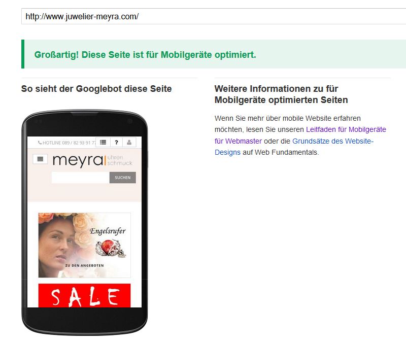
Test for responsiveness at Google
According to our research, mobile visitors vary from 5% up to 25% of visitors to a website. The differences are mainly due to the distinction between the orientation of websites for the target groups end customers and business customers. Fewer visitors to mobile devices can be found on business-used websites, so-called B2B websites. For websites used primarily by end customers, so-called B2C websites, the share of smartphone users is much higher. The proportion of visitors to mobile devices will continue to increase in the future. An outlook shows the percentage of visitors according to mobile devices divided by continents on the website of Statista. Africa and Asia are here with almost 40% top riders. An adaptation to a mobile view is therefore not possible.
What are the possibilities for a mobile display of websites?
In order to make a representation on smartphones and tablets ideal, there is essentially Responsive Design and Mobile Design. In Responsive Design the content adapts to the resolution of the device. Different representations are determined after certain breakpoints. Examples of this are e.g. webdesign.bayern, juwelier-meyra.com or drkloeppel.com. By the way, web pages where the mobile adaptation was carried out by us.
In the case of Mobile Design, the mobile version of the website is usually located on a subdomain. These websites are often recognizable by the subdomain m.domain.de in Google’s search. Examples of this are m.ebay.de, m.faz.net or m.abendzeitung-muenchen.de – only on mobile devices with links. The advantage is that the mobile version is operated in parallel and is very individual in appearance. The disadvantage of this is the increased maintenance effort. For this reason we do not offer mobile design or mobile websites.
The Breakpoints in Responsive Design
The appearance of a responsive website is oriented towards breakpoints or breakpoints. Nowadays, mobile devices, tablets and screens for PCs are available in a variety of resolutions and it is therefore necessary to orientate themselves to these resolutions. An orientation on the screen width is necessary.
Recommended breakpoints in the Responsive Design are – not finally listed:
- 320 px width
- 480 px width
- 768 px width
- 992 px Width
- 1200 px width
Advantages of Responsive Design
In the customer’s journey, Customer-Journey, you can ideally accompany the future customer. Whether the customer wants to get into action with you mobile or prefers later on the tablet or on the PC, he always has a good impression of your website. Spontaneous actions can be expected faster on the mobile device and the conversion rates from visitors to paying customers increase.
One thing has to be observed with the responsive design: Only well done, brings advantages. If errors are present in the mobile display, this can sometimes affect the visibility of Google and lead to declines in search engine positions.
Best to test your own page on mobile user-friendliness right on https://www.google.com/webmasters/tools/mobile-friendly/ and act.
Feel free to speak with us for a successful responsive design, whether new or existing website or webshop. Click here to see the contact data.
Schreibe einen Kommentar zu "Responsive web design: making your site work on smartphones"