

Whether web shop or website
Responsive Design: Optimise and benefit mobile
References of our Responsive Design Implementations
Responsive web design makes it easier for visitors to read your content on small screens, send requests and complete orders. The click costs in Google Ads depend, among other things, on the competition, campaign and auction. We check the mobile user guidance and actual campaign data for your website.
We prefer a mobile implementation for the systems WordPress, Typo3, Redaxo and Joomla. It is common with webshops in the mobile conversion Shopware, Veyton, xt Commerce and Magento. If you have not found your system, please ask us.
How do we proceed with mobile implementation?
Display previous static website or new website Responsive
Our approach to mobile implementation of a so far static website:
- Check whether an update of your system is necessary to maintain future viability.
- Prerequisite and testing
- Post-integration of call-to-actions, verification of the accessibility of information and presentation with necessary corrections. Also check whether certain content can also be completed during mobile implementation.
- Detailed crossbrowser and crossdevice testing. So we test the website via different browsers and end devices, which therefore also take into account the resolutions of the devices. Finally, last corrections of the display take place.
Our approach to creating a new website
- The Mobile First approach is often in the foreground, which is basically correct.
- We rely on the correct arrangement of content elements on a website and thus also in testing in implementation as well as an internal quality-enhancing final acceptance on arrangements. Occasionally, we remove certain content elements due to the overview in small resolutions.
- Detailed Crossbrowser and Crossdevice Testing.
The share of mobile users in Germany and the important turnover
Responsive design with mobile presentation is rapidly gaining importance
In Germany, the share of smartphone and tablet visitors on a website varies between 20% and 60% depending on the industry. The fluctuation range is more to business customers or private customers due to the respective orientation of a website, as well as whether it is consumer goods or capital goods. Fewer visitors to mobile devices can be found on commercial websites, so-called B2B websites. For websites used primarily by end customers, so-called B2C websites, the share of smartphone users is much higher. The proportion of visitors to mobile devices will continue to increase steadily in the future.
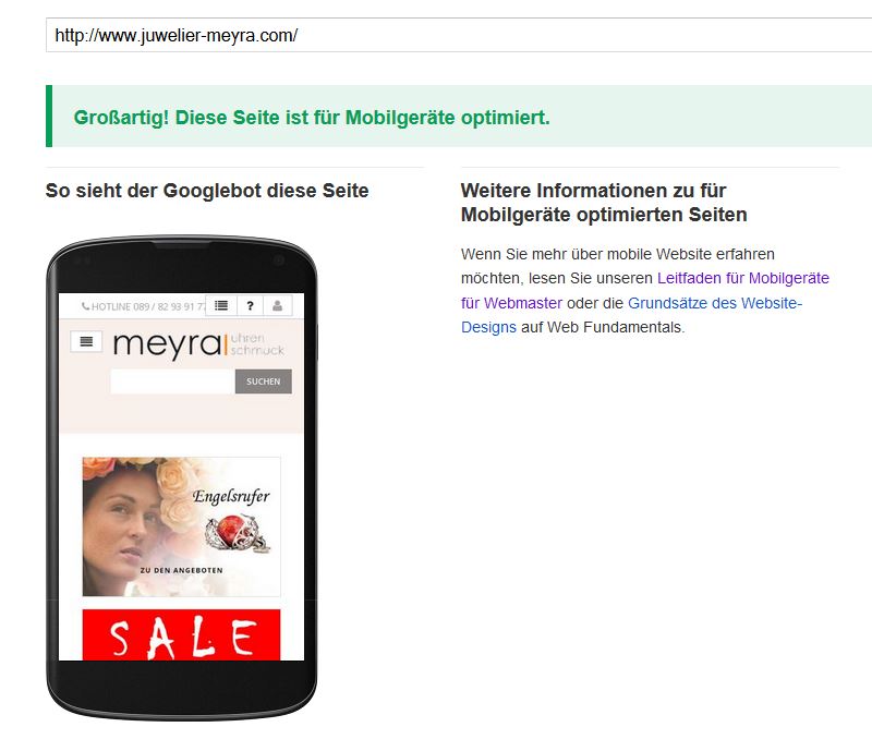
Google’s Responsiveness Test
The so-called mCommerce has reached a share of 14.44 billion euros in Germany in 2015, with the share of eCommerce online trade being almost 28% in the meantime. The division between smartphones and tablets is practically high.
The growth rates of the last years were enormous with the numbers of visitors as well as with the turnover figures. Reason enough to put his homepage on it.
Don’t rely on the test for mobile devices at Google! This test is always only valid for the tested page and you do not see any consideration of the different resolutions.
Don’t put it into effect, makes it your competitor
Responsive Design equal request and secure competitive advantages

Make it easy for you to contact us. Just call us for a non-binding offer, tel. 089 / 68 09 80 57, or use our contact form. We look forward to working with you.
Common questions
We inform about Mobile and Responsive Design at this point
- What are the possibilities for a mobile display of websites?In order to make a representation on smartphones and tablets ideal, there is essentially Responsive Design and Mobile Design. With Responsive Design the content adapts to the resolution of the device. Different representations are defined after certain breakpoints. Examples of this are e.g. webdesign.bayern, juwelier-meyra.com or steuerkanzlei-muc.de. By the way, websites where the mobile adaptation was carried out by us.
For Mobile Design the mobile version of the website is usually on a subdomain. These websites are often recognized by the subdomain m.domain.de in search in Google. Examples of this are m.ebay.de, m.faz.net or m.abendzeitung-muenchen.de – only on mobile devices. The advantage is that the mobile version is operated in parallel and is very individual in appearance. The disadvantage is the increased maintenance effort. For this reason we do not offer Mobile Design or Mobile Websites.
- What are these breakpoints in the responsive design?The appearance of a responsively oriented website is based on breakpoints or breakpoints. Nowadays, mobile devices, tablets and screens for PCs are available in a variety of resolutions and it is therefore necessary to orient oneself to these resolutions. An orientation to the screen width is necessary.
- Which breakpoints are recommended in the Responsive Design?
- 320 px width
- 480 px width
- 768 px width
- 992 px Width
- 1200 px width
- What are the benefits of Responsive Design?In the customer’s journey, called Customer-Journey, you can ideally accompany the future customer. Whether the customer wants to contact you mobile or prefers later on the tablet or on the PC, he always has a good impression of your website. Spontaneous actions can be expected faster on the mobile device and the conversion rates from visitors to paying customers increase.
One thing has to be observed with the responsive design: Only well done, brings advantages. If errors are present in the mobile display, this can sometimes affect the visibility of Google and lead to declines in search engine positions.